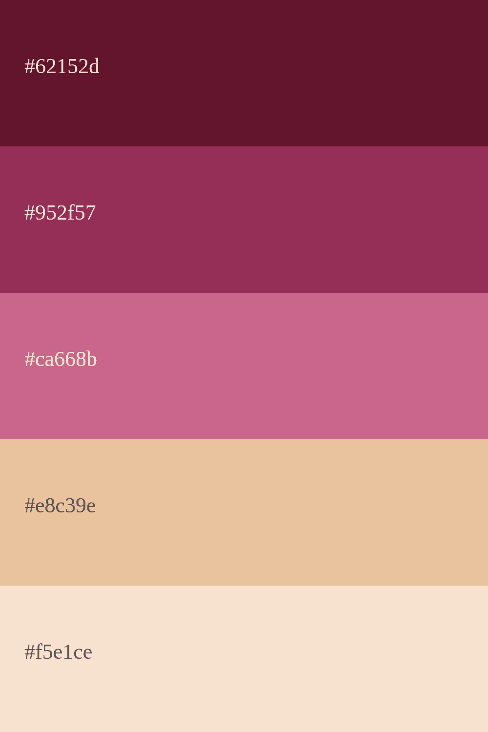
Cherry Color Palettes: Inspiration for Your Creative Projects
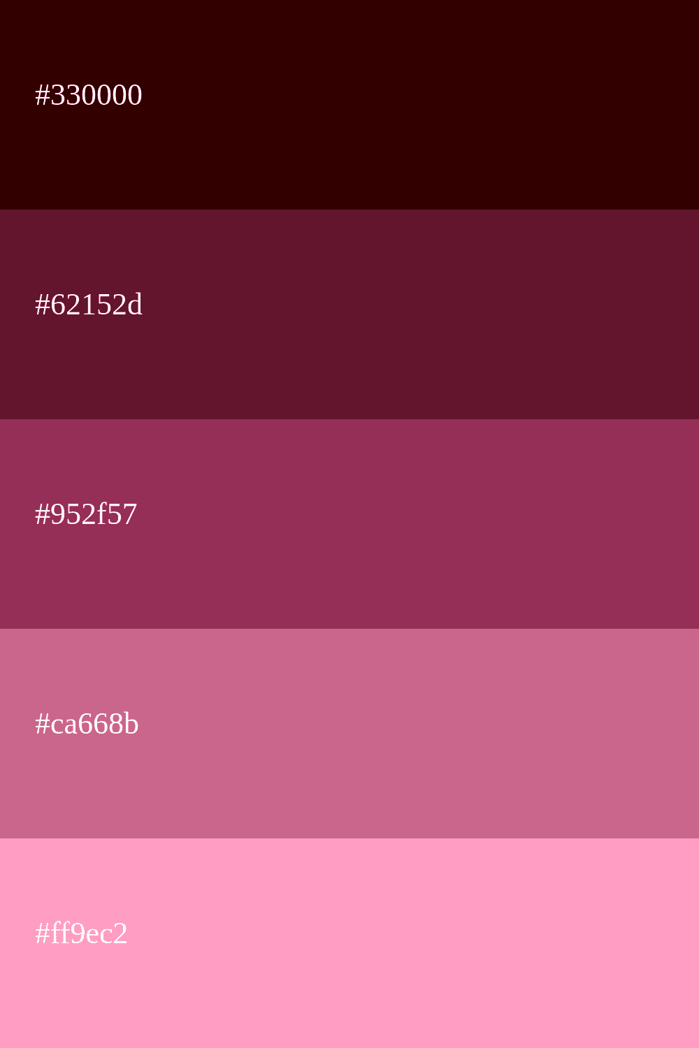
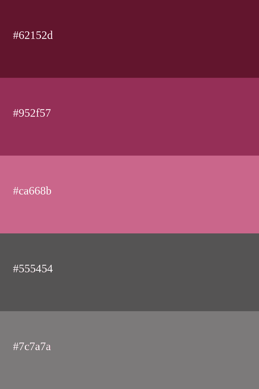
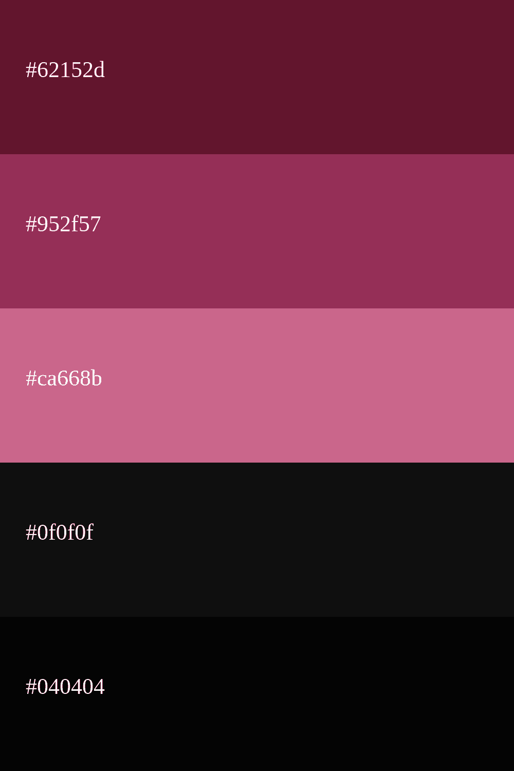
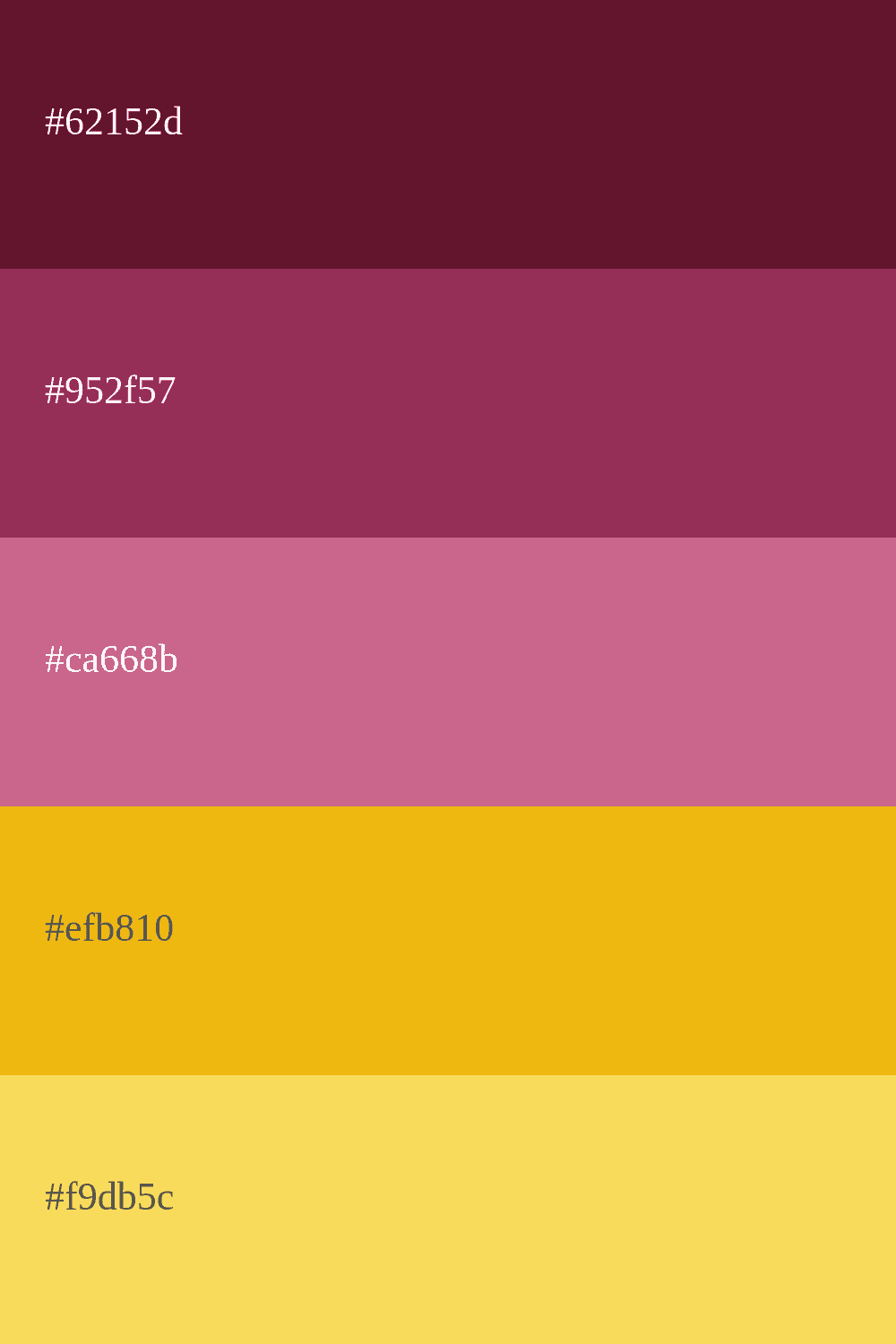
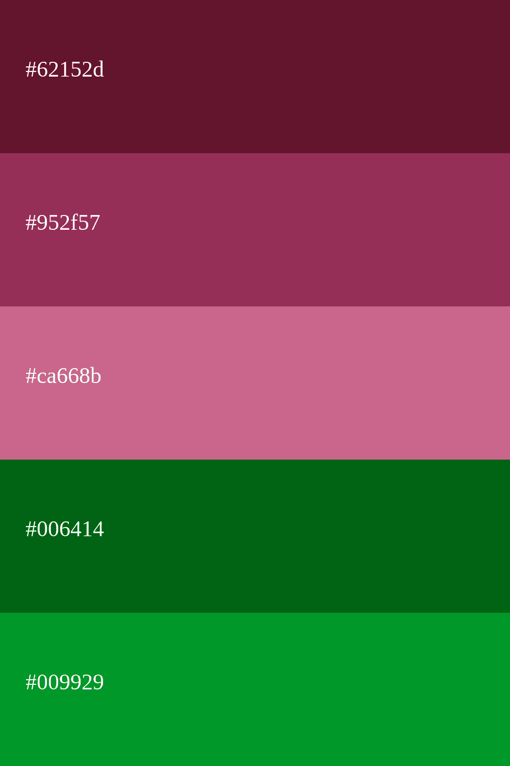
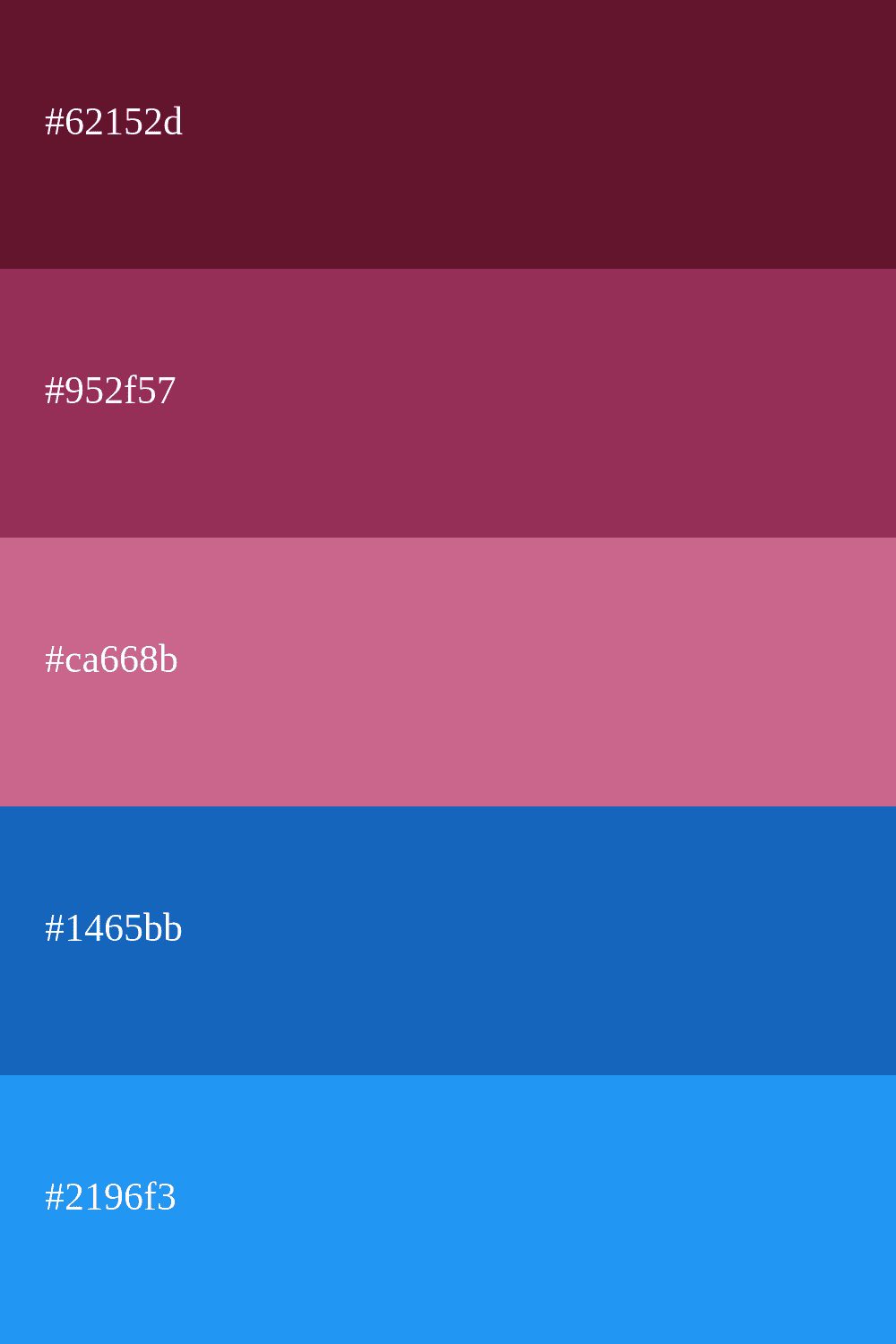
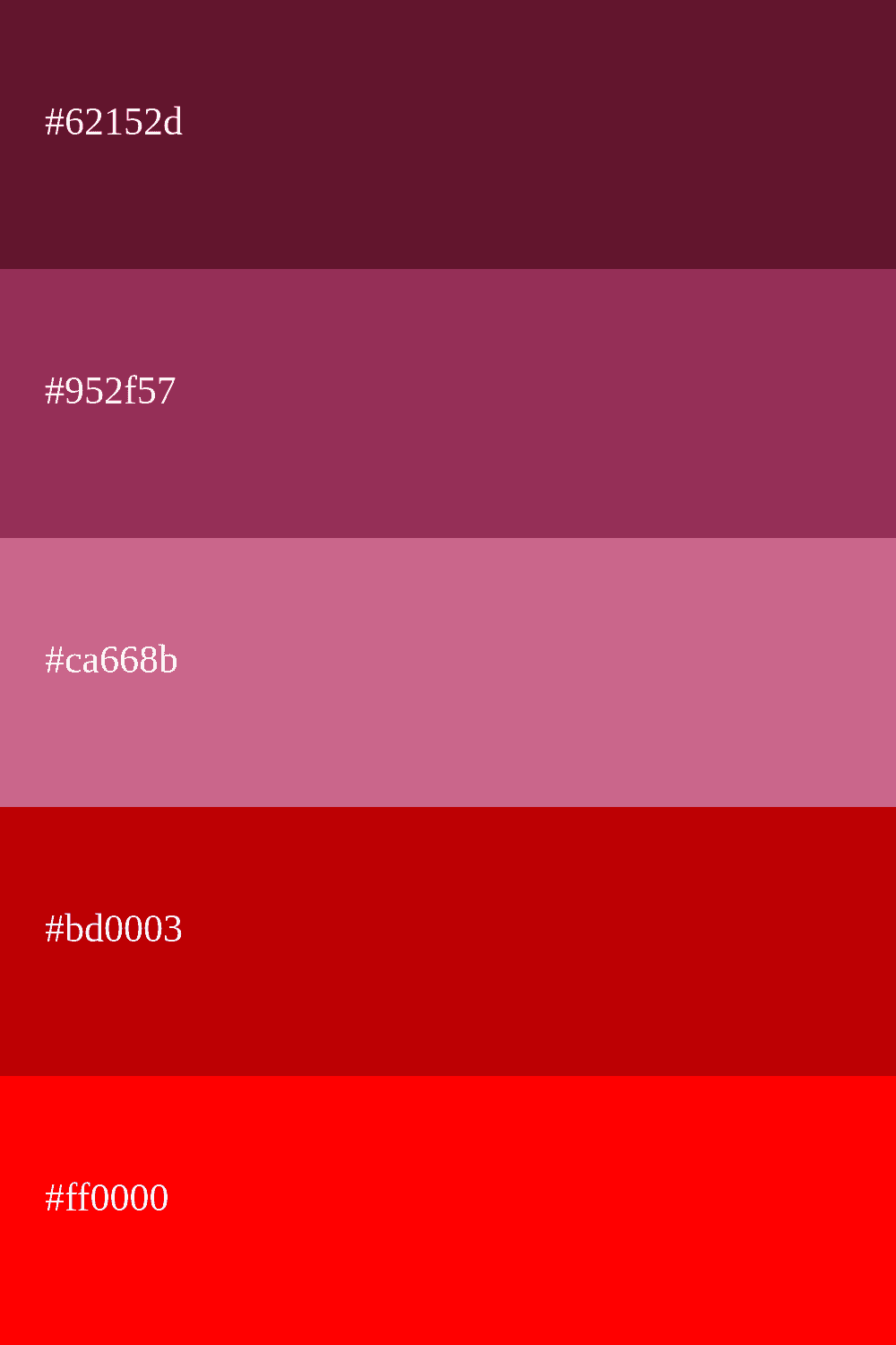
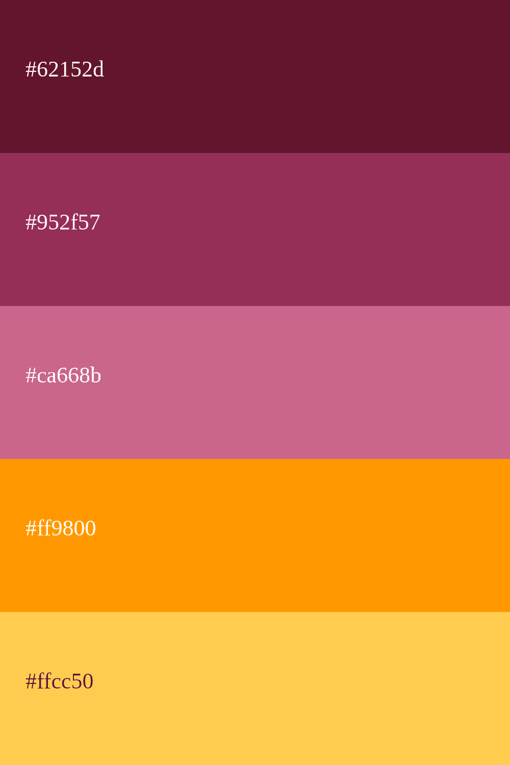
cherry color schemes
Welcome, design and creativity enthusiasts! 🎨 Are you ready to dive into the fascinating world of cherry color? In this exciting post, we will explore beautiful color palettes that evoke the elegance, passion, and sophistication of this hue.
cherry, with its deep and warm tone, is a perfect choice for a wide range of projects, whether you're designing a website, decorating your home, or creating visually stunning artworks.
Are you ready to unleash your creativity and experiment with these exciting tones? Let's continue and discover the endless possibilities that the burgundy color palette offers! 💫🍷
Ideas to combine the cherry color
What is cherry Color? 🍒
Cherry color is a rich and deep hue found within the red spectrum , although it tends to have a darker and closer-to-purple tint. It's characterized by its resemblance to the color of ripe cherries, giving it a natural allure and a warm sensation.
Its name comes from the French word "cerise," which means cherry. This naming choice is quite fitting, as cherry color shares many visual similarities with the natural shade of this delicious fruit.
Cherry is a versatile color that can vary in saturation, ranging from softer and more muted tones to bolder and more striking shades.
Its versatility makes it suitable for a wide range of design applications, from fashion and interior decoration to graphic design and web development. This color evokes emotions such as passion, sophistication, and elegance, and its usage can have a powerful impact on the perception of a project.
