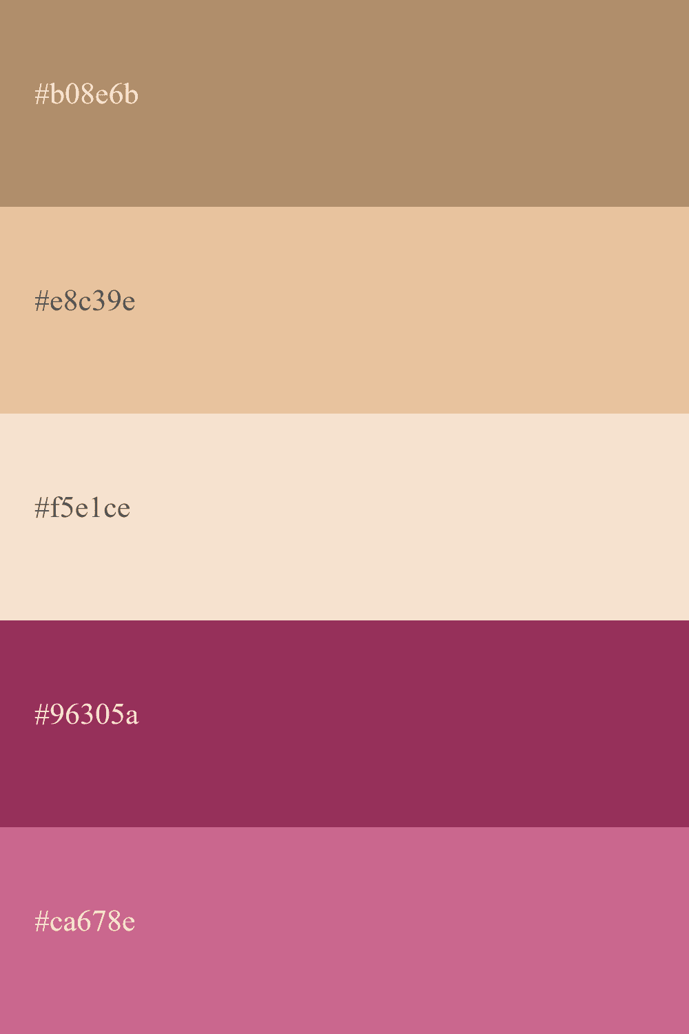
Beige Color Palettes: Explore Stunning Combinations for Your Designs
Beige is a pastel color also known as cream color, with a light tone very close to white. It is obtained by mixing white with brown, with white being the dominant color to achieve that tone we know as beige or cream.
Speaking of its use in color palettes, cream is a color frequently used in interior decoration because it conveys a sense of calmness and neutrality, which are essential for achieving harmonious designs.
In web design, there has been a recent trend towards these types of neutral colors, such as beige, thanks to the popularity of flat design.
So, whether you're painting your house or choosing the color for your website, a beige color palette is an excellent option to consider. Below, we present different combinations of beige colors for you to choose the ideal mix for your next project.
17 Ideas to Combine Beige in Your Color Palette
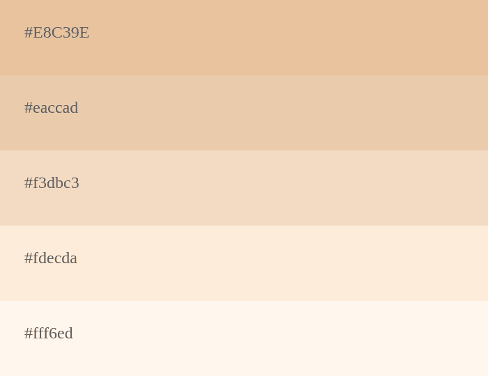
A warm and versatile palette featuring shades of beige for a timeless and elegant look. ✨🎨
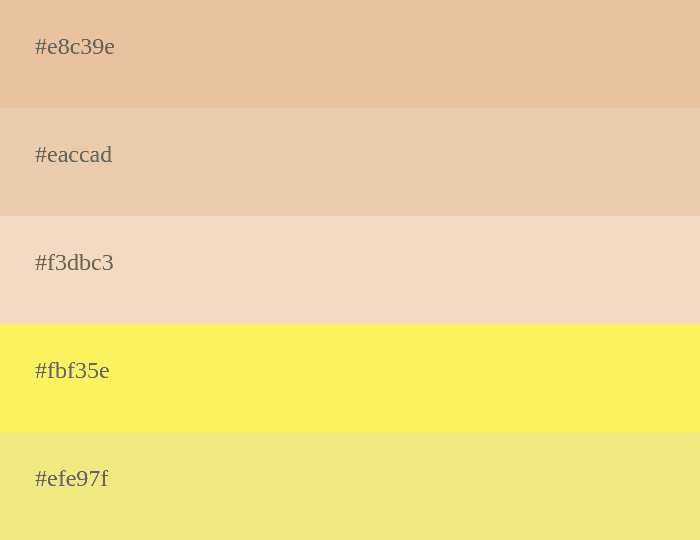
Embrace a sunny vibe with this delightful combination of beige and cheerful yellow hues. ☀️🌼
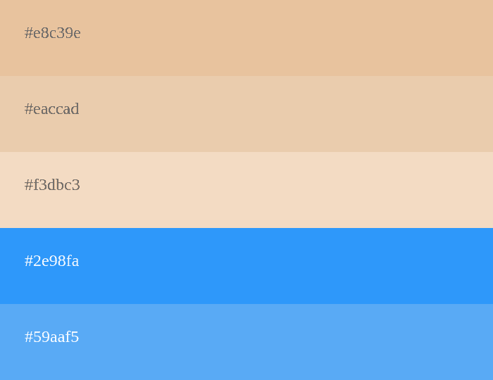
Dive into a serene ambiance with soothing shades of beige and tranquil blue tones. 🌊💙
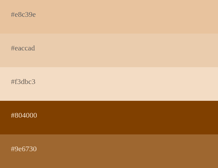
Earthy and rich, this palette combines shades of beige and brown for a cozy and natural feel. 🌳🍂
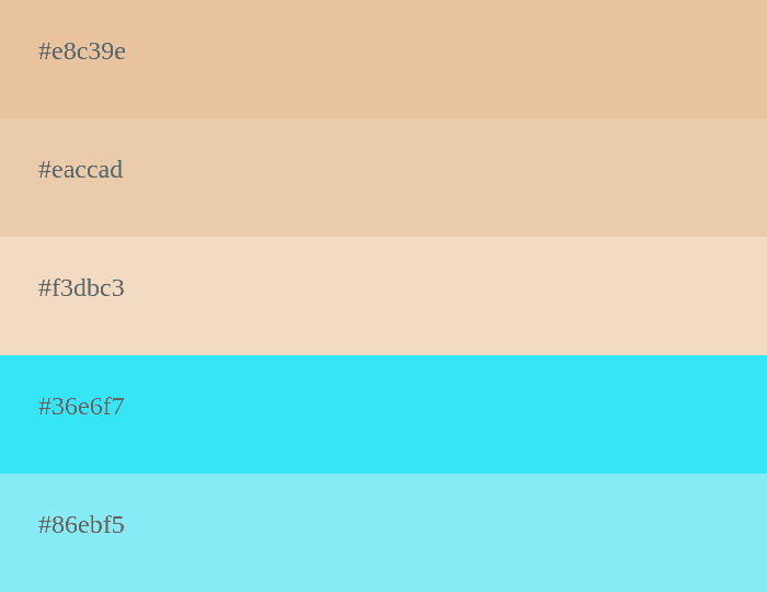
Refreshing and cool, this palette combines serene shades of beige with vibrant cyan accents. 🌿🌊
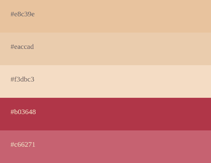
Sophisticated and luxurious, this palette merges elegant beige with deep and rich garnet shades. 💎🍷
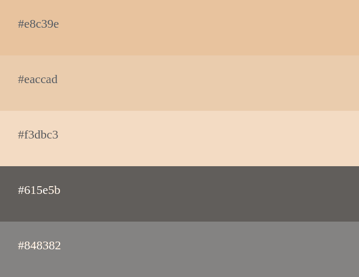
A modern and minimalistic palette featuring the timeless combination of beige and stylish gray tones. ⚪️🔲
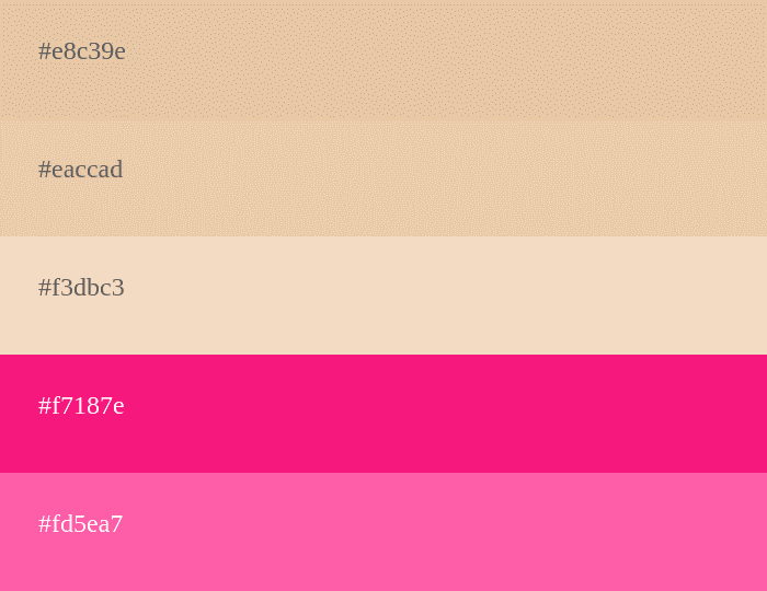
Make a statement with this bold pairing of beige and vibrant magenta hues. 🎉💗
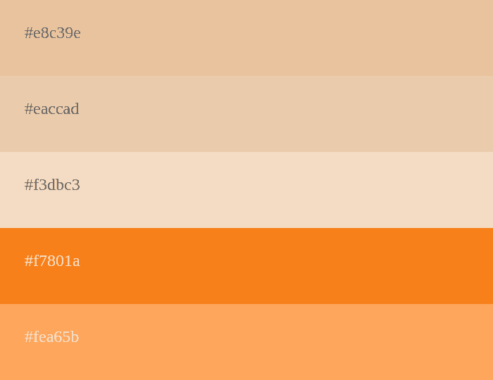
Energize your space with the warm and inviting blend of beige and lively orange shades. 🍊🔆
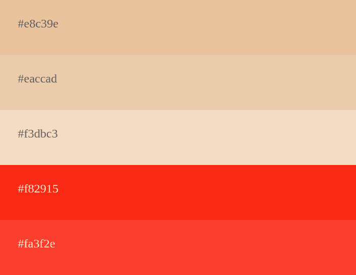
Create a striking look with the contrast of beige and bold red tones for a touch of passion. ❤️🔥
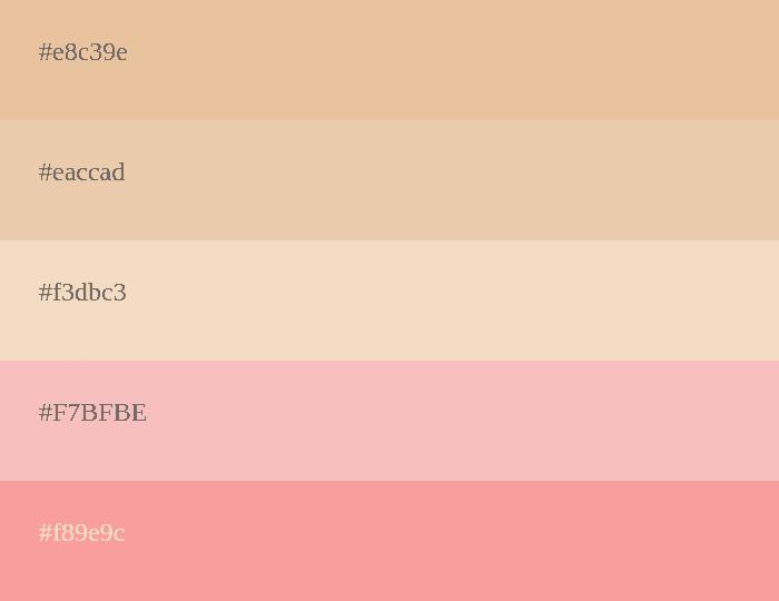
Soft and feminine, this palette combines delicate beige with gentle pink shades for a romantic atmosphere. 💕🎀
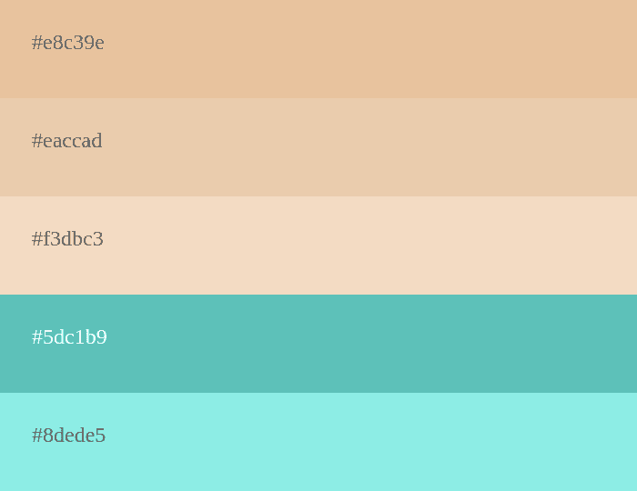
Transport yourself to a tropical paradise with this soothing blend of beige and refreshing turquoise hues. 🏝️🐠
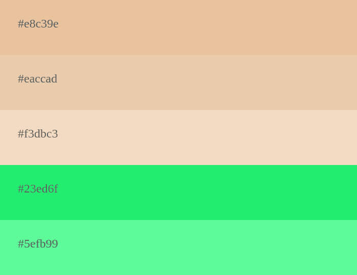
Embrace nature's harmony with this palette that combines serene beige tones with fresh and vibrant green shades. 🌿🌱
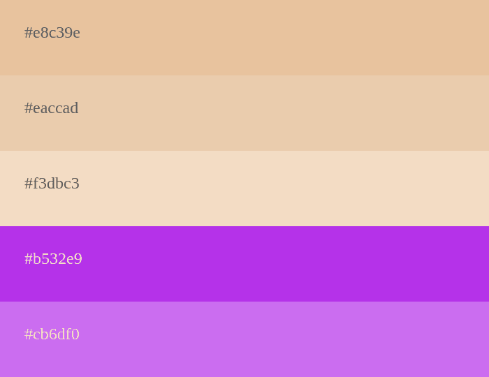
Experience elegance and mystique with this enchanting mix of beige and regal purple shades. 🌌💜
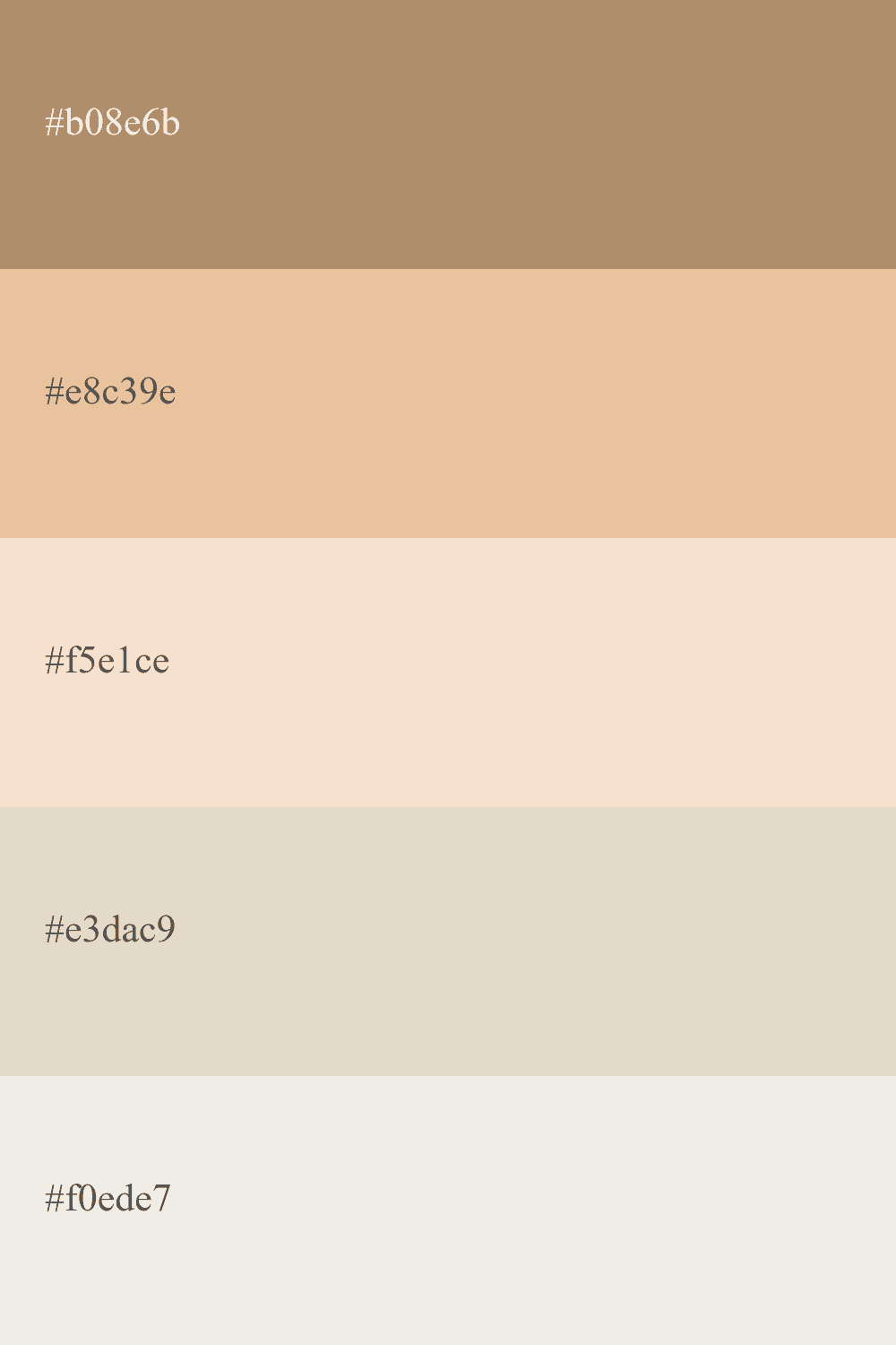
A refined and neutral palette featuring the timeless combination of bone and classic beige for a sophisticated look. ⚪️🌟
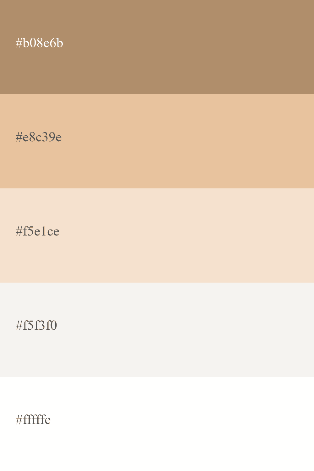
Pure and elegant, this palette showcases the timeless beauty of beige and clean white tones for a fresh and airy feel. ⚪️✨
How to Combine Beige in a Color Palette
Beige is a light color, so it is recommended to combine it with a darker tone to achieve an ideal contrast.
This can vary depending on where you are applying the color; interior design is different from web design.
Speaking of web design, we suggest using beige as the main background color and incorporating a darker color like magenta to highlight interface components such as buttons.
Frequently Asked Questions about the Color Beige
Beige is a neutral and versatile color that can be combined with a wide variety of colors. Some popular options include white, black, gray, green, blue, red, and pink.
There are several shades of beige that vary in hue and brightness. Some of the most common tones include light beige, medium beige, dark beige, yellowish beige, pinkish beige, and grayish beige.
Beige and cream are two similar tones, but cream color tends to be lighter and warmer than beige. Beige, on the other hand, can be slightly darker and have a more neutral or grayish tone.
Beige is commonly associated with calmness, tranquility, and serenity. It can also convey a sense of elegance and sophistication. Due to its neutrality, beige is a popular color in interior design and mobile/web applications to create a relaxed and harmonious atmosphere.
