Cold Color Palette Ideas: Combinations and Codes
What Are Cold Colors?
Cold colors are those found on the left side of the color wheel, and they are known as cold because they convey feelings of freshness, tranquility, and serenity. They include shades like blue, green, and violet, and are ideal for creating relaxing environments.
In contrast to the warm colors located on the opposite side of the color wheel that convey a completely different sensation.
List of the 6 Most Important Cold Colors
- 1 - Blue: It is the quintessential cold color and one of the most widely used colors throughout history, undoubtedly one of the most beautiful colors.
- 2 - Green: It is a color associated with nature and is one of the most versatile colors to combine in your color palette
- 3 - Turquoise: This color is a cool shade obtained from the blend of blue and green, belonging to the cyan color range.
- 4 - Cyan: Beautiful color obtained by combining blue and green, with several lovely shades like aquamarine and turquoise.
- 5 - Pink: When talking about beautiful colors, we cannot leave out pink, which is a light tone derived from magenta.
- 6 - Magenta: : This color is on the boundary between cold and warm colors, with its more intense tones considered as neon colors.
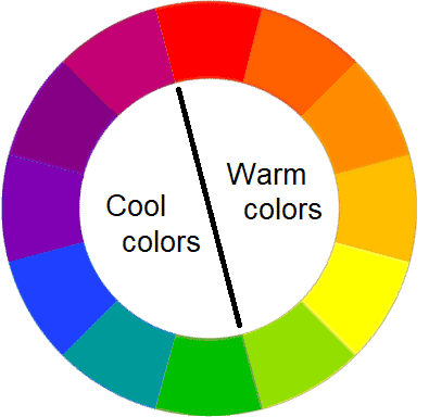
Both green and magenta are on the border of this division between cold colors and warm colors . For example, a pear green becomes a warm tone.
Ideas for Creating Cold Color Palette Combinations
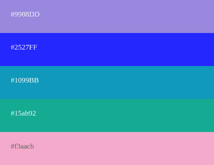
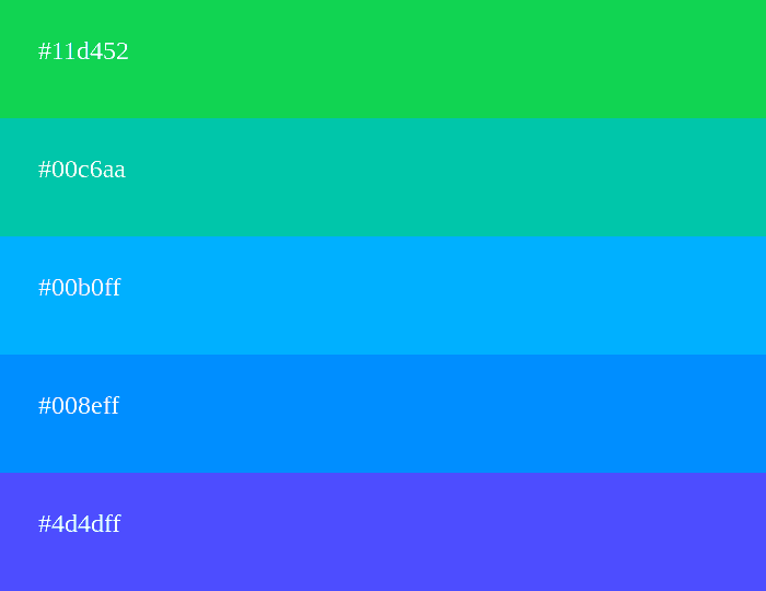
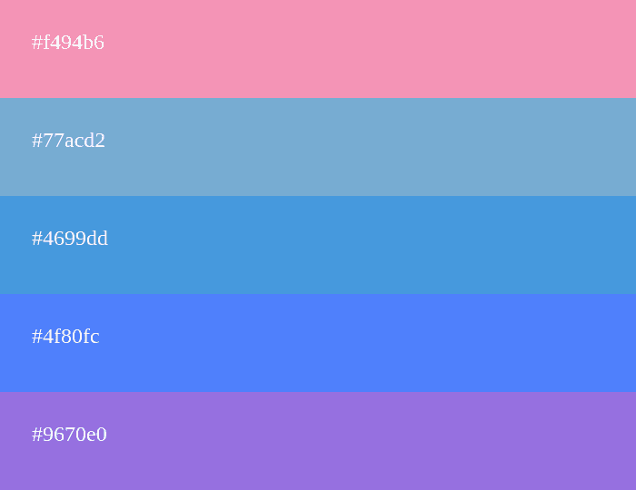
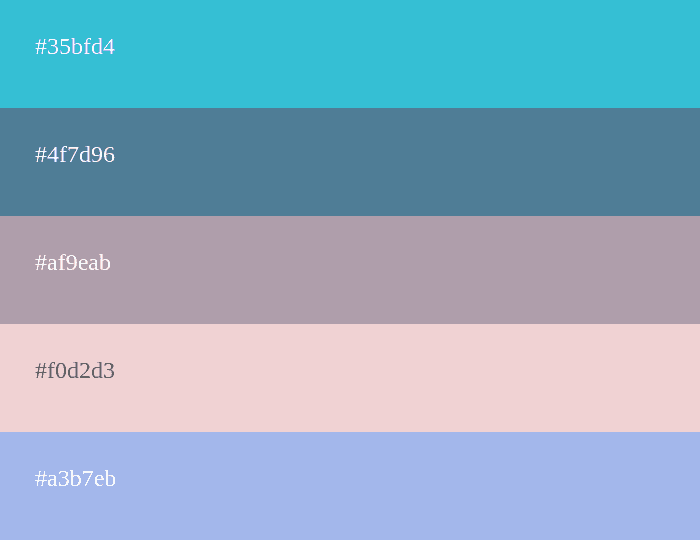
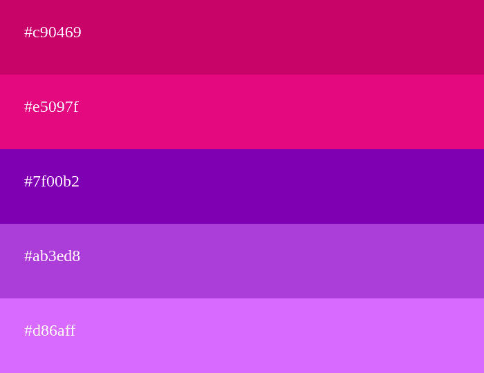
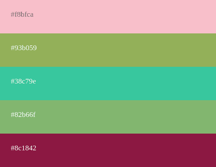
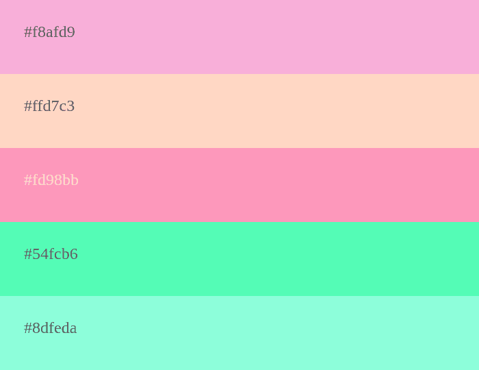
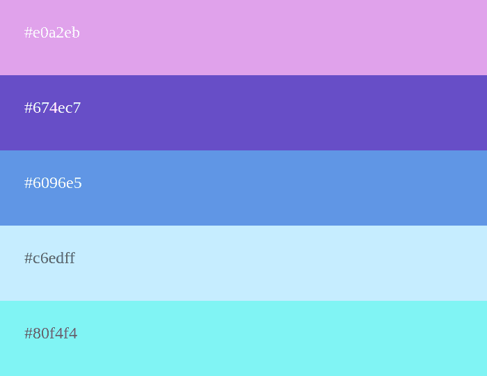
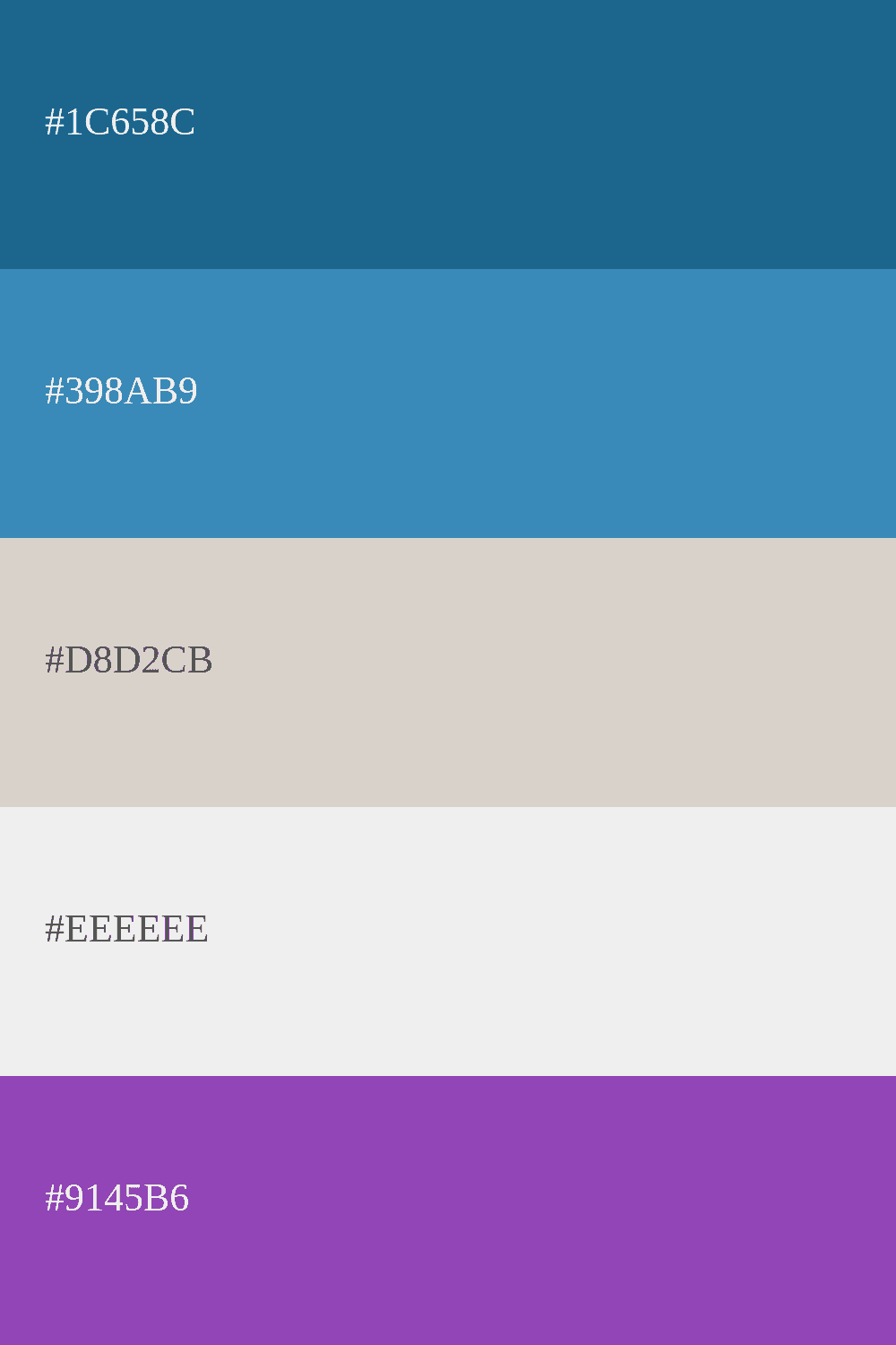
If you're unsure which color to choose for your palette, we'll show you various combinations of cold colors that you can use to create beautiful designs and decorations in your projects. NOTE: You can also take a look at pastel color palettes for more beautiful combinations.
Relevant Questions About Cool Color Palettes
You can use a cool color palette in your design in many different ways. For example, you can use shades of blue or green to create a calm and serene foundation, and then add accents of more intense colors like purple or bluish-gray to create contrast. You can also play with the saturation and brightness of cool colors to create interesting and dynamic visual effects. Experiment and play with combinations to find the palette that best suits your project!
Some current trends in cool color palettes include the use of soft and delicate shades of blue and green, inspired by nature and water elements. Cool color palettes with touches of metallic colors like silver or gold are also seen to add a touch of luxury and sophistication. Another interesting trend is the use of cool color palettes combined with warm or neutral colors to create unexpected contrasts and add more depth and dynamism to designs.
Cool colors have various associated meanings. Blue often represents tranquility, serenity, and freshness. Green can evoke nature, harmony, and hope. Purple can convey mystery, elegance, and spirituality. In general, cool colors are often associated with emotions and sensations of calm, relaxation, and freshness, making them a popular choice for creating peaceful and serene atmospheres in design and creativity.