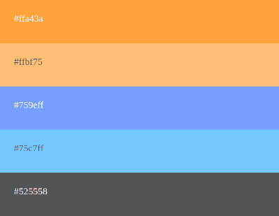
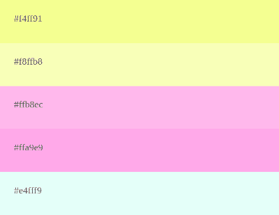
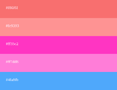
8 Websites to Generate and Create Color Palettes Online
To help you find the perfect color combination, we've compiled a list of the best online custom color palette generators in 2023. Below are various websites that are completely free, where you can discover the perfect palette that best suits your brand design and style.
Later on, you'll find a detailed explanation of different color scheme types and some tips for putting together a beautiful palette.
1 - paletadecolores.online unleashes your creativity with our Swiss Army Knife
Let's start with ours; we're striving to provide you with the best possible experience and meet your expectations. Some features you can find in our tool include:
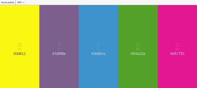
Simply clicking the "New" button will generate a palette with 5 random colors. Repeat the process until you find the perfect color combination. Explore the different functionalities available for each color.
Once inside the generator, different colors appear with their respective hexadecimal (hex) codes, so you can use them directly in your HTML, CSS, website, or any other design tool like Illustrator, Figma, or Photoshop.
You can access the different schemes for each color, whether monochromatic, complementary, triadic, or analogous. All with the respective HTML codes for each color generated.
Allows changing the color code type and displaying it in one of the following variants: RGB (Red, Green, Blue) or HEX (hexadecimal).
You have the option to copy the color value directly to your clipboard with just one click to paste it directly into your project.
Pressing the download button will save the palette image directly to your device in PNG format with the color codes in hexadecimal format.
We also have a section where you can create your own color palettes.
We also offer a tool to mix colors to provide you with multiple options to achieve the color that best suits your project.
We've added functionality to extract the color palette from an image ; you can find it in the menu under the tools section.
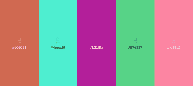
2 - Coolors.co: Find the Color Palette You Need for Your Website
Coolors.co is the most popular color palette and scheme generator in the Anglo-Saxon market. It offers an intuitive interface and multiple tools ranging from a color picker to a gradient generator. It also has a smartphone app. Some of the key features of this color generator include:
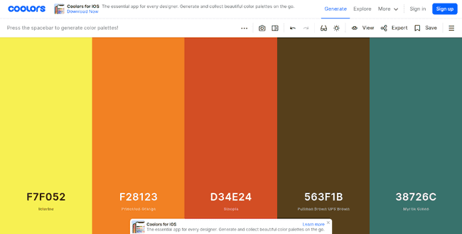
Coolors.co excels in creating beautiful color schemes and codes that blend well. If it's your first time using the tool to generate a palette, simply press the space key.
Another great feature of Coolors.co is the ability to download an image with the generated colors in various formats such as SVG, PNG, PDF, among others.
It has a utility bar where you can find controls to adjust the hue, saturation, brightness, and temperature of the palette.
Each generated palette includes the names of the colors and can be exported with their respective codes in various formats such as a text file, PDF, or CSS.
Another significant advantage offered by Coolors.co is its integration with the entire Adobe software suite.
The functionality to create gradients from 2 colors was recently added.
Coolors.co has been online for a while, accumulating a large user base, many of whom have previously created and saved their color schemes that you can reuse on your website.
With all these features, this generator is a great option to consider when finding the ideal color for your next project.
3 - Color Hunt: Endless Ideas to Create Your Color Palette
This website offers numerous color templates with different styles, tones, and designs. Take a look and discover for yourself the almost infinite variety of pages offering colors. Some of its key features include:
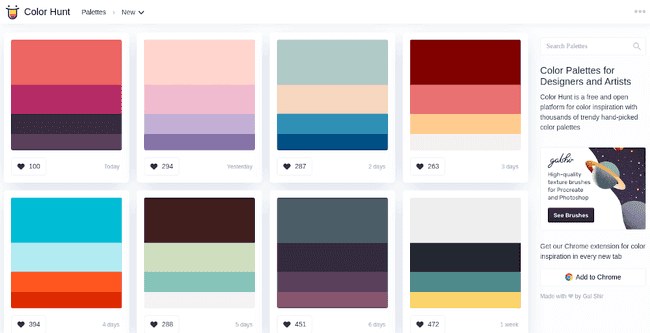
The main page of Color Hunt is updated daily with the latest palettes created by other users on the platform.
It provides a vast array of colors for inspiration, and you can create your own palettes and share them for others to use in the future.
Similar to Coolors.co, Color Hunt also boasts a large user base, providing many palettes to explore and find the one that best fits your project. You can filter to view the most voted, trending ones, or random palettes to discover multiple schemes.
One of the features we love is that you can bookmark your favorite color palettes or choose to download them in PNG image format.
Additionally, Color Hunt has a Google Chrome extension that displays one of the highest-rated palettes on the website.
Each color palette consists of 4 colors, clearly indicating the primary, secondary, etc. You also have the option to copy the hexadecimal code of each color.
If you already have a specific color in mind, enter its name in the search bar and find all the palettes containing that color.
4 - Adobe Color: Color Wheel to Unleash Your Creativity
If you want to create a color palette, Adobe Color is a design tool that cannot be missing from your toolkit. Undoubtedly, it is currently one of the most widely used tools and has the backing of the giant and creator of tools like Photoshop or Illustrator, Adobe. Here are its main advantages:
We have to acknowledge that if there's one thing Adobe excels in, it's the creation of design software, and Adobe Color is no exception. Its interface stands out for being quite advanced and intuitive.
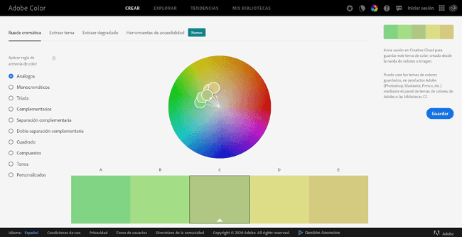
Essentially, it's a color wheel (chromatic circle) where you can move the pointer to the area of the color you prefer, and the tool automatically generates a color palette based on the configuration.
You can adjust the configuration to obtain different color schemes and combinations, such as: Analogous, Monochromatic, Triad, Complementary, Split Complementary, Square, among many others.
The colors are available in both hexadecimal code and RGB.
In the top bar, you have other functionalities to further complement your search. The "Extract Theme" section is for pulling colors from an image, the "Extract Gradient" section is for extracting the gradient from an image, and in the accessibility tab, you can check the contrast between different colors and see if that combination is suitable for colorblind individuals.
Last but not least, we must highlight its complete integration with the Adobe Creative Cloud suite. This feature is one of the main reasons why we love this wonderful chromatic color wheel.
5 - colourco.de - Online Color Palette for HTML and CSS
If you prefer a straightforward color generator, colourco.de is a fantastic option for obtaining various color schemes and blends. As with the previous tools, let's describe its main features and functions:
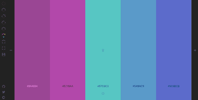
When you first enter, a single color appears. Hovering over it, you'll notice how it changes to different shades. The higher up the pointer, the darker the color, and towards the bottom, you'll get a lighter tone.
To select a color, simply click, and the tool will automatically stop changing the background, leaving the tone you've chosen.
On the right side, there's a bar with a plus sign to add more colors to the palette.
In the utility bar on the left side of the screen, you select the type of scheme you want to generate.
You can also export in various formats such as PNG image, Sass variables for use in CSS, or as a link to share the URL.
6 - colormind.io: Generating Combinations with Artificial Intelligence
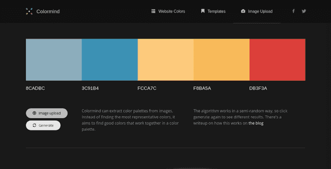
Describing themselves as a color scheme generator that uses deep learning (artificial intelligence), colormind.io learns color styles from photographs, movies, and art.
Its basic operation is similar to the previous ones: click the generate button and discover a combination of 5 colors. Each color comes with several options: a lock to prevent that color from repeating in subsequent palettes, a picker to manually change the color, and arrows to adjust the positions of each color.
In the menu, you'll find several tools. The first one, "website colors," will be very useful. Essentially, it creates a complete landing page using the generated colors, including buttons, cards, and other components, allowing you to easily visualize the final result on a real webpage.
The second tool is similar to the first but instead of a landing page, it designs a dashboard using the generated colors.
The third tool allows you to extract a color palette from an image. In conclusion, despite not being the most popular generator, it is one of our favorites due to its multiple functionalities.
7 - Paletton: One of the Oldest Color Generators
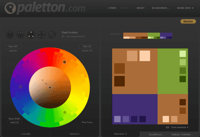
Paletton is the oldest color palette generator. This tool offers a color wheel or chromatic circle similar to Adobe Color but with a more austere and vintage design. It provides options for complementary, analogous, and other color schemes.
At its time, it was a pioneering and very useful tool. Unfortunately, its developers have lagged behind in the application's design, causing it to lose popularity in the market. Take a look and draw your own conclusions.
8 - BrandColors - Color Codes of Major Brands
To conclude this extensive list of tools for creating your palettes, we want to present one final recommendation, which, although not a generator, serves as inspiration to see how the most popular brands in history have combined different colors to create a palette that conveys all the values of their company.
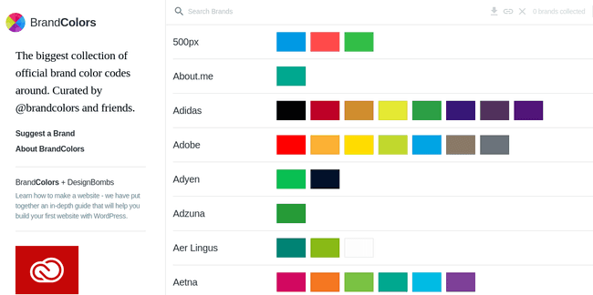
Once on the site, you can see a list with each brand and the entire range of shades they use in their visual identity. You can search for a specific brand and copy the HTML codes for each color.
In the list, you'll find colors chosen by brands such as: Adidas, Adobe, FedEx, CNN, Cloudflare, among many other major companies.
Why Do You Need a Color Palette Generator?
Color blending online is a very common and important activity in the virtual world we live in today, especially in areas like design, illustration, or web development. Blending colors is a part of the daily work we must do to make everything look beautiful for our visitors.
While you can delve into color theory and learn more about this wonderful world, you can also turn to tools that do all the work of generating colors for you.
So whether it's for an online project, your website, or choosing the color to paint the walls of your house, one of the tools presented above will help you by showing different combinations and schemes so that you can have a complete range of options at your disposal and choose the palette that best suits your brand's style.
Types of Color Schemes: Which One Should You Choose for Your Business?
There are countless combinations to create visually congruent and impactful color palettes. While you can follow your instinct and manually create your own palette, there are certain combinations already established by color theory that provide predefined color schemes that work well together. Here are the four main color schemes:
1. Monochromatic Color Scheme
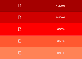
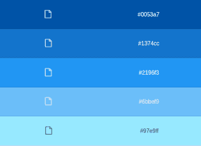
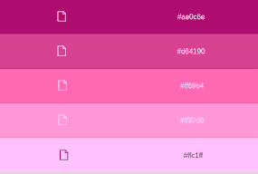
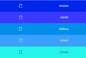
This model is based on only one color and is completed with its different hues, tones, and shades, both dark and light.
Monochromatic colors allow for an attractive combination without much effort, as being of a single color conveys a sense of unity. That's why many designs nowadays are based on monochromatic palettes. They are also recommended for individuals who may not have a strong foundation in design, as it's challenging to go wrong and create an unpleasant color scheme.
Examples of Monochromatic Color Schemes
2. Complementary Color Scheme
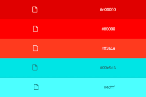
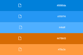
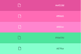
This scheme is composed of colors that are opposite each other on the color wheel, such as red and turquoise or blue and orange. They are ideal for conveying a sense of balance and for highlighting call-to-action elements.
They create an interesting contrast when used appropriately. Caution: you should have a primary color that will be dominant and a secondary one to use only in components that need to stand out. Using both in equal proportion could cause visual fatigue for your users.
Examples of Complementary Color Schemes
3. Analogous Color Schemes
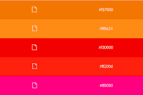
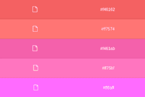
Analogous color schemes consist of a main color and its close neighbors on the color wheel. With this combination, you can highlight specific elements and create beautiful contrasts.
Looking at the color wheel at the bottom, an analogous palette would be composed of a red color as the main one, along with the orange and magenta colors to emphasize components within our design.
This scheme is recommended for use because it consists of colors that, although different, have similar tonalities.
Examples and Ideas for Analogous Color Schemes
4. Triadic Color Scheme
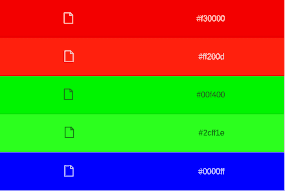
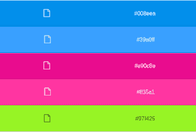
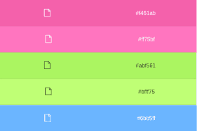
Triadic color schemes are composed of three colors that are quite separated from each other on the color wheel, and these schemes can be formed by three primary, secondary, or tertiary colors.
One of their disadvantages is that they are challenging to combine, so you should be cautious about choosing a hierarchy of different levels. For example, use one of the colors in 75% of your design, another in 20%, and the third only in 5% to achieve an attractive balance. Remember that this depends on each color in the palette and how it combines with the others.
Examples of Triadic Color Schemes
Tips for Creating Your Brand Color Palette
Now that you understand color scheme concepts, it's time to learn how to create your own color palette. Here are some tips to help you select shades, tones, and combinations to achieve the most beautiful color palette possible:
The first recommendation when choosing a color is to explore different sites to gain a broad perspective on how they use colors for their brand.
Currently, there is a trend in design for monochromatic colors. Many websites and brands prefer selecting a single color in different shades to create balanced interfaces. If you want a straightforward approach, this is an ideal choice.
The color scheme that yields the best blends is the analogous one. So, if you want to ensure your colors are compatible, you can select a color, such as pink, and create your palette based on its analogous color scheme using our tool, then download it for your project.
Another way to create a good palette is to avoid warm and intense colors like red, yellow, or orange. It's not that these colors are ugly, but the issue is that they draw too much attention and are very flashy, which can be counterproductive.
If you must create a palette from an intense color, we advise choosing a variant in a pastel color tone . This way, you can make it less flashy.
Lastly, don't forget about neutral colors like gray, brown, and black. They are always good complementary options to consider.
